Interpreting Results
Backtest results in Arconomy are organised into three levels of detail. You start with a high-level summary of all backtests, drill down into the iteration results for a specific run, and then inspect individual strategy results at the trade level. This layered approach lets you quickly assess overall performance and then investigate specific areas of interest.
Results Hierarchy
After a backtest completes, results are presented across three screens that progressively increase in detail:
| Level | What It Shows | Drill Down By |
|---|---|---|
| Backtest Summary | All backtests, with total gross profit and iteration count for each | Click a row to see iteration results |
| Iteration Results | Each trading account within each iteration, with per-account performance | Click a row to see the strategy result |
| Strategy Result | Positions, orders, and detailed trade metrics for a single account in a single iteration | Click the information icon for full trade details |
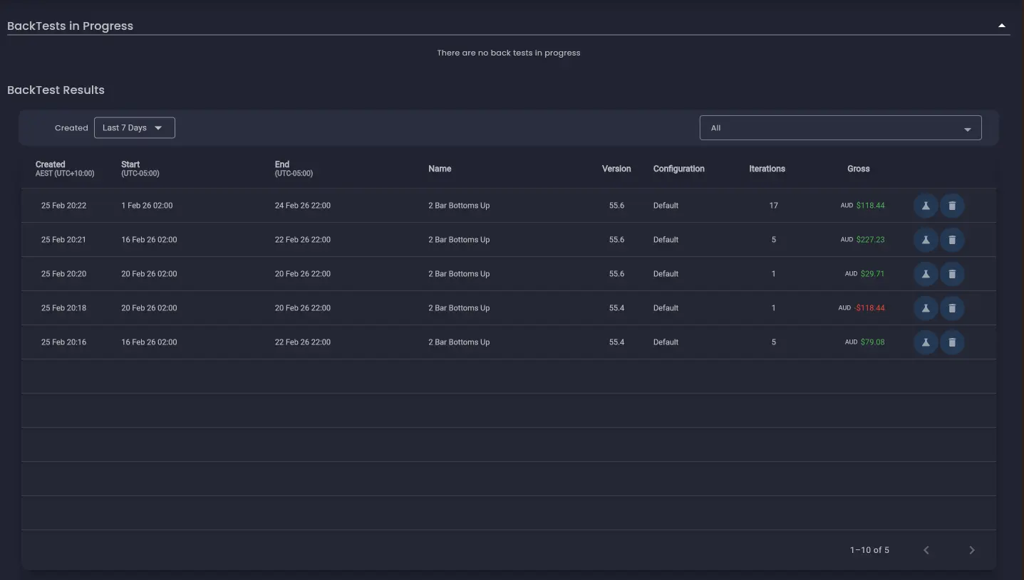
Backtest Summary
The Backtest Summary screen is the top-level view of all your backtest runs. The most recently completed backtest appears at the top of the list. Each row provides a consolidated performance overview showing the total gross profit across all iterations within the backtest, together with the number of iterations executed.
From this screen you can re-run an entire backtest by clicking the lab flask icon, which navigates back to the backtest configuration screen with the previous settings pre-populated.
Click on any row in the summary to drill down into the iteration results for that backtest run.
Iteration Results
The Iteration Results screen displays the individual execution outcomes for the selected backtest. Each row in the table corresponds to the outcome of a single trading account within a specific iteration.
The number of rows depends on how many iterations the backtest produced and how many Trading Accounts were configured in the strategy:
- If the strategy was backtested across 17 iterations (for example, 17 trading days) with one Trading Account, the table displays all the rows in which trades were placed. In this example, 15 rows — one per iteration in which trades were placed.
- If the strategy was configured with two Trading Accounts and both had trades during each iteration, the table will display twice as many rows as iterations capturing the performance of each account independently.
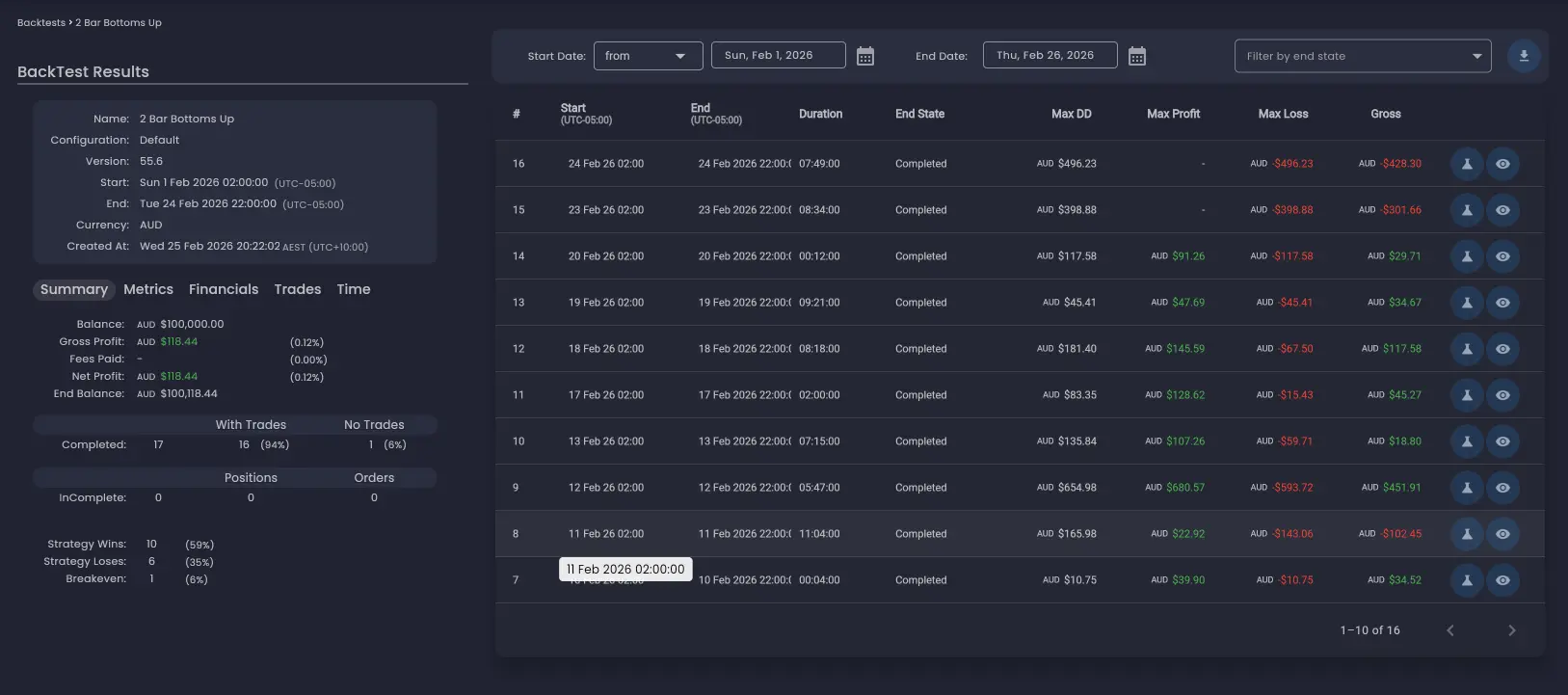
Performance Summary Panel
On the left-hand side of the screen is the performance summary panel, which shows aggregated metrics across all executions in the backtest. The panel contains several tabs with different categories of metrics:
- Financials — Profit, loss, and financial performance analytics.
- Trades — Trade-based metrics such as win rate, average trade size, and trade count.
- Time — Time-based performance analytics.
End State
Since backtests are executed over fixed time intervals, iterations can end with open positions or unfilled pending orders still in the market. The End State column indicates the final state of the strategy for each iteration.
By default, only iterations where the strategy actively traded are displayed. You can use the drop-down filter to display iterations that finished in each end state, including those that ended with no trades.
Ideally, a strategy should be designed to finish in a Completed end state within the backtesting iteration time period. For example, a strategy trading a specific market session should aim to close positions favourably and prevent placing new trades before the end of the trading session to avoid overnight exposure.
Re-running a Single Iteration
You can re-run a single iteration by clicking the lab flask icon on its row. This navigates to the backtest configuration screen, which is automatically populated with the required settings for that specific iteration. This is particularly useful when you want to perform deeper analysis on a specific iteration — for example, re-running an outlier result with a more detailed analysis mode.
Viewing the Analysis Screen
When a backtest contains more than a single iteration, the Final State (No Analysis) mode is used by default. This means only the final state of the strategy is available for review. You can access the final state of a strategy execution by clicking the eye icon on the iteration row.
For backtests run with a more detailed analysis mode (Full Analysis, Time-Based, or Trade-Level), clicking the eye icon opens the full analysis screen where you can walk through the strategy execution timeline. The analysis screen is covered in detail in the Trade Analysis section.
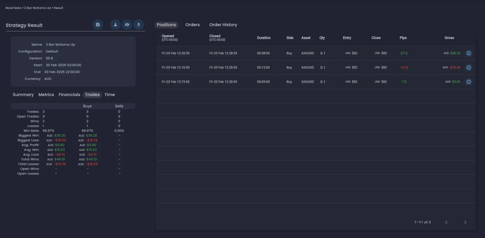
Strategy Result
Clicking a row in the Iteration Results table drills down to the Strategy Result screen for a specific trading account within a specific iteration. This screen provides a detailed view of what the strategy did during that execution.
The Strategy Result screen includes:
- Summary and metrics — Performance calculations specific to this strategy result, including profit/loss, trade count, and other key metrics.
- Positions tab — A table showing all positions that were opened during the execution, with entry and exit details.
- Orders tab — If the strategy did not end in a Completed state, there may be pending orders outstanding. These are displayed in the Orders tab.
- Order History tab — Orders that were cancelled before they were filled can be viewed in the Order History tab.
To see the full details of an individual trade, click the information icon on its row and search for a specific field.
Performance Metrics
The performance summary panel and strategy result screens display a range of metrics. Here are some of the key metrics to understand when evaluating results:
- Net Profit — Total profit or loss after all costs. Expressed as both an absolute value and a percentage return on the initial balance.
- Win Rate — The percentage of trades that closed in profit. A high win rate is not required for profitability — what matters is the relationship between win rate and the average win-to-loss ratio.
- Profit Factor — The ratio of gross profits to gross losses. A value above 1.0 means the strategy is profitable overall. Values above 1.5 indicate solid profitability with room for real-world friction.
- Maximum Drawdown — The largest peak-to-trough decline in equity during the backtest. This is one of the most important risk metrics — it represents the worst-case loss you would have experienced.
Designing for a Clean End State
When reviewing iteration results, pay attention to how many iterations ended in a Completed state versus those that ended with open positions or pending orders. A high proportion of incomplete iterations may indicate that the strategy needs adjustment:
- Open positions at iteration end — The strategy did not close all positions before the iteration time period expired. Consider adding exit logic that closes positions before the end of the trading session.
- Pending orders at iteration end — Orders were placed but never filled. This could mean entry conditions were met but the market did not reach the order price. Review whether limit order levels are realistic. Add logic to cancel pending orders if the order does not fill within a set timeframe or at the end of the iteration.
- No trades — The strategy's entry conditions were never met during the iteration. This is normal for some iterations but a high proportion of no-trade iterations may indicate overly restrictive entry criteria.
Red Flags to Watch For
Certain patterns in backtest results should raise immediate concern:
- Curve fitting — Exceptional performance on one specific date range but poor performance on others. Test across different ranges and use iterative execution to verify consistency.
- Low trade count — Fewer than 30 trades does not provide enough data points for statistical significance. Aim for at least 100 trades to draw meaningful conclusions.
- Inconsistent performance — If most of the profit came from a few iterations while the rest were flat or negative, the edge may not be reliable.
- Too-good results — Unrealistically high returns with minimal drawdown may indicate over-fitting to the historic data rather than a genuine edge.
What to Do After Reviewing Results
Once you have reviewed your backtest results, the typical next steps are:
- If results are poor — Re-run the backtest using Full Analysis or Trade-Level Analysis mode on a shorter time period. Examine the analysis screen to understand why individual trades lost money. Adjust your rules and backtest again.
- If results are promising but unvalidated — Switch to iterative execution to verify that performance is consistent across multiple independent intervals. Re-run any outlier iterations individually with a more detailed analysis mode to investigate what happened.
- If results are validated and robust — Test against an out-of-sample time period, then proceed to paper trading on a demo account to verify that live execution matches backtest expectations. Only move to live trading after a successful paper trading period.
For a detailed breakdown of this progression, see the recommended workflow on the Strategy Execution Iterations page.
The best traders treat backtesting as a continuous process, not a one-time event. Markets evolve, and a strategy that works today may need adjustments in the future. Schedule regular re-evaluations of your deployed strategies using fresh data.
Was this helpful? Let us know